Adding Color without Commitment
Many of my clients love bold colors, while others would rather step more gingerly. We all know by now I am the first to encourage you to take chances, but I have also witnessed the “I painted my living room Easter Bunny Purple” mistake. The painter is happy to get paid twice, but I am thinking you aren’t ok with that, so here’s my plan.
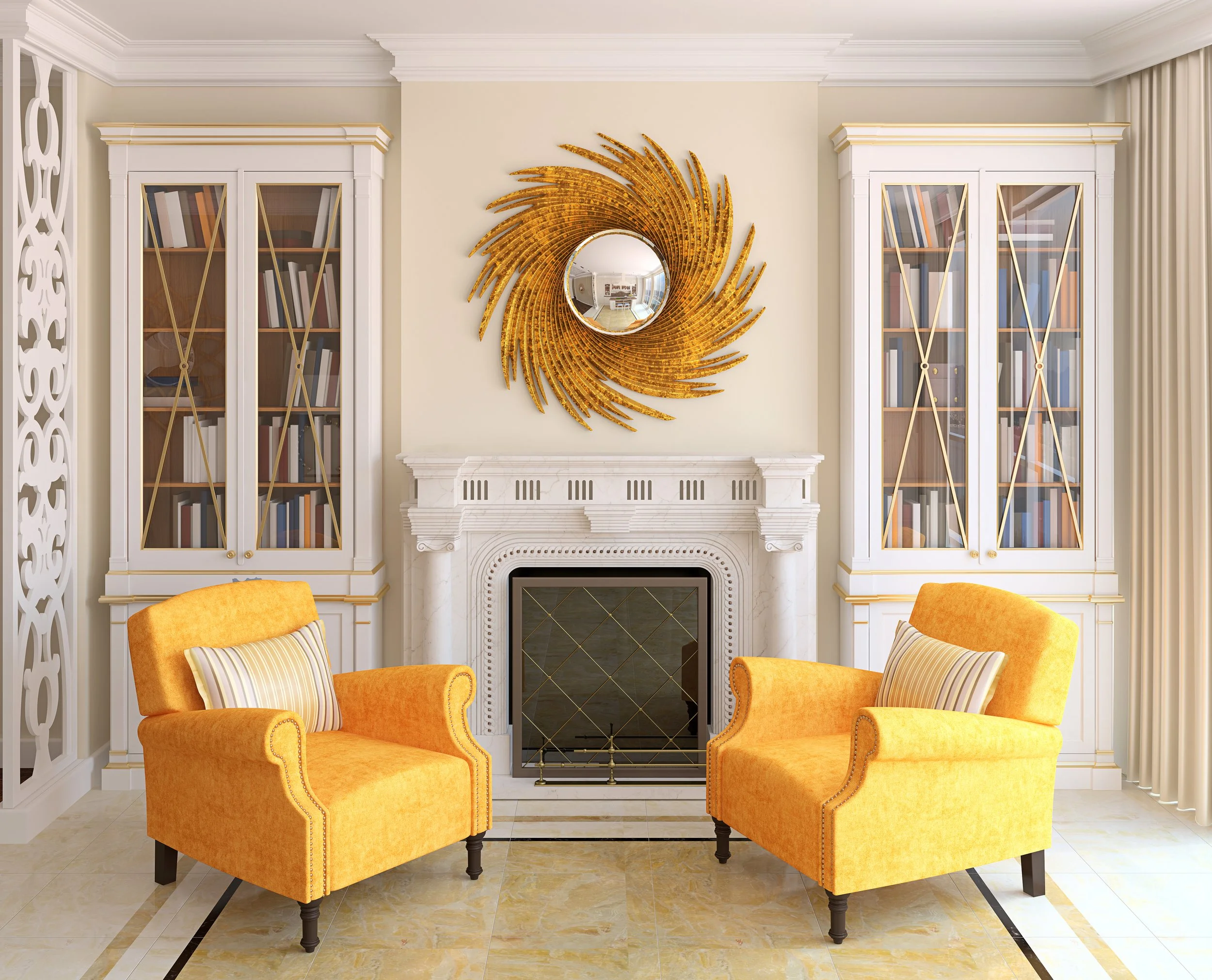
When a client says “bold color,” I think one of two options: 1. a room that is less lived in and therefore safe to take big chances…. say a power room or a media room, or 2. A space where we can use mostly soft or neutral hues and judiciously add accents of strong, bold colors that can be easily replaced.
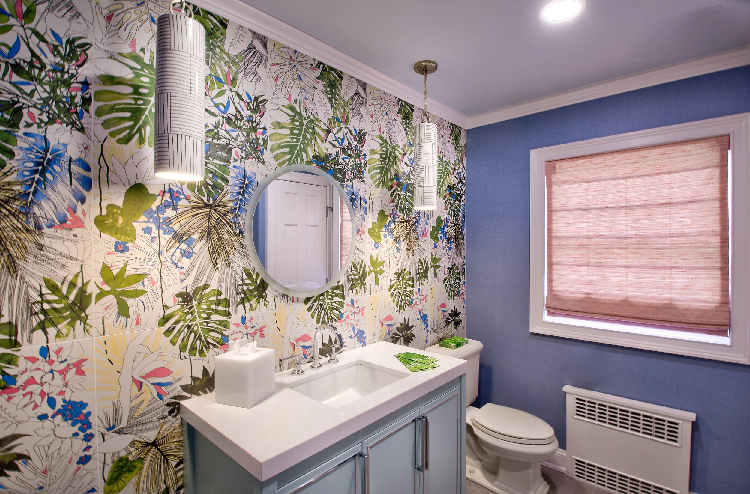
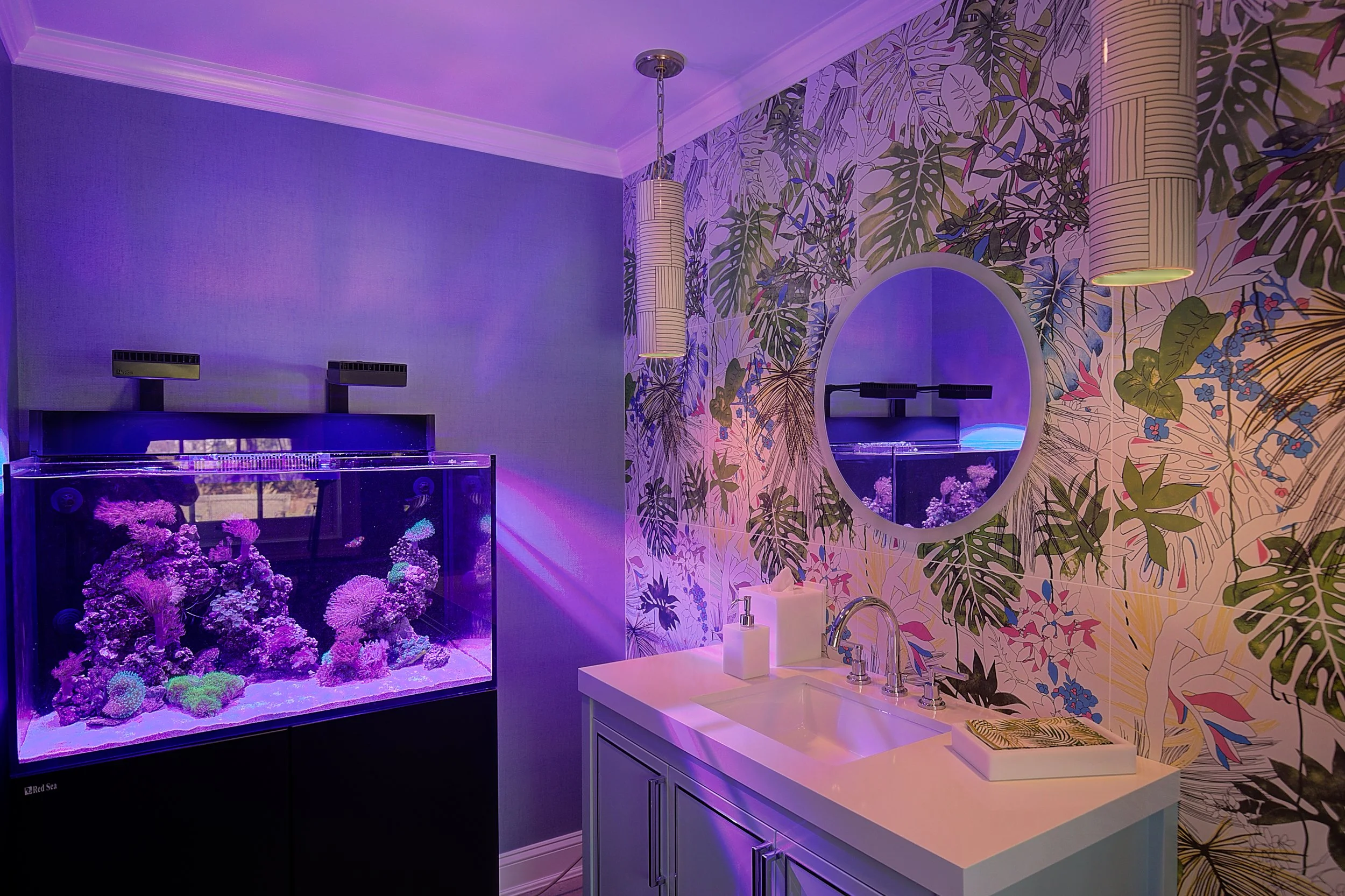
Tropical hues like hot pink and turquoise are some of my favorites, so in this client’s powder room off their pool, we went to town with a large scale, bold tile (yes, it’s tile, not wall covering) wall of a tropical jungle theme. And…we added a tropical fish tank! We are not sleeping or dining in here, so this is a fun place to play with vibrancy, but there is a fine line between fun and tacky, so I kept the durable vinyl wall covering a much more subtle shade of blue. The passionately pink Roman shades are strong enough to tie everything together and balance out the bold tile colors, but they are not screaming Barbie.
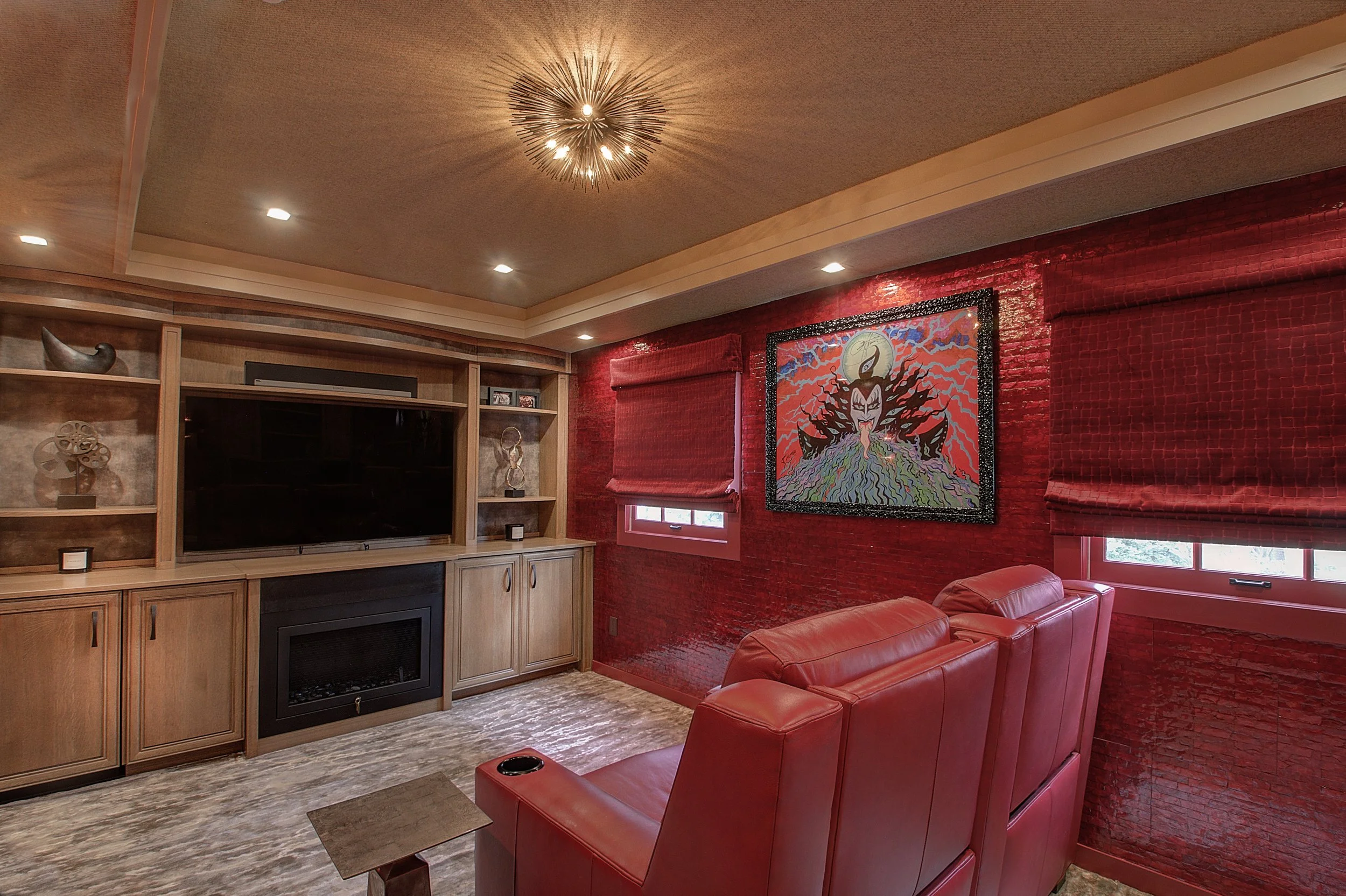
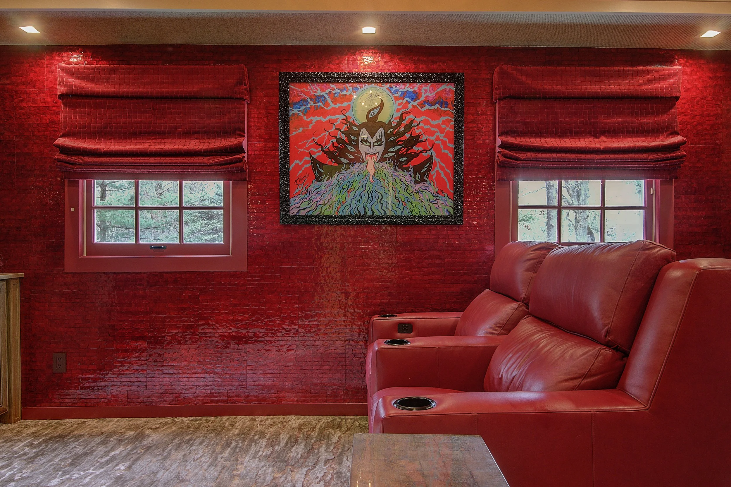
I love design drama and my favorite example of this is the “Red Room.” It’s a media room, where drama is called for, so we really took chances. A bright red mother of pearl wall covering graces one wall (real shells in this absolutely fabulous wall covering from @MayaRomanoff), and a deep red baseball stitched wallpaper graces others. We even kept the client’s colorful and raucous Gene Simmons painting on the wall. Key to creating a bold space is to balance the bold with calm, so I toned this space way down with soft, natural textures of tan grasscloth and walnut cabinetry. Juxtaposition is vital here. Don’t go overboard. Gene does that well enough.
In dining rooms, bedrooms and highly used living spaces, stick to the calmer, neutral, not so powerful tones on areas that are more permanent: wall coverings, paint colors, and large, pricier items such as dining tables, sofas or beds, should be a hue you can live with for a decade or more. I add accents of strong colors to items I can change more easily, such as art, accessories, pillows or an accent chair. A room can undergo a drastic transformation just by adding hot pink pillows and throws in the summer and changing them to tones of mulled wine and pine wool in the winter.